
Unleash the Power of Your Sales Data
This listicle reveals eight sales dashboard best practices to transform your data into actionable insights. Learn how to optimise your sales dashboard for maximum impact, driving strategic decisions and revenue growth. Discover how defining key metrics, intuitive design, real-time updates, and predictive analytics can revolutionise your sales performance. From data filtering to mobile accessibility, these sales dashboard best practices will empower your team and unlock your business's full potential.
1. Define Clear KPIs and Metrics
The cornerstone of any effective sales dashboard is the careful selection and definition of Key Performance Indicators (KPIs) and metrics. This foundational best practice ensures your dashboard focuses on the data points that genuinely matter, driving actionable insights and aligning with your overarching business objectives. Simply put, it's about choosing quality over quantity. Instead of overwhelming your dashboard with every conceivable metric, concentrate on those directly impacting revenue generation and sales team performance. This approach empowers you to monitor progress effectively, identify areas for improvement, and ultimately boost your bottom line. For UK-based TikTok Shop sellers, eCommerce entrepreneurs, and data-driven retailers, this is particularly crucial in navigating the dynamic online marketplace.

This best practice entails several key features. First, it demands alignment between your chosen KPIs, your overall business goals, and your specific sales strategy. This ensures everyone is working towards the same objectives. Secondly, it necessitates a balance of leading indicators (predictive metrics like lead generation) and lagging indicators (outcome metrics like revenue). This provides a holistic view of performance, allowing for both proactive adjustments and retrospective analysis. Furthermore, effective KPI definition acknowledges the diverse needs of different roles and departments within your organisation, allowing for customised dashboards that deliver relevant insights to each team. Finally, clear and documented calculation methods are crucial for consistency and accuracy in reporting, ensuring everyone understands how the figures are derived. You can learn more about Define Clear KPIs and Metrics for a deeper understanding.
Examples of Successful Implementation:
- Salesforce: Implements tiered KPIs, using primary metrics like revenue supported by secondary metrics like lead conversion rates. This layered approach provides a granular understanding of performance drivers.
- HubSpot: Segments KPIs by sales funnel stages, allowing for targeted analysis of each step in the customer journey. This helps pinpoint bottlenecks and optimise conversion rates at each stage.
Actionable Tips for Readers:
- Limit Primary KPIs: Keep the number of primary KPIs on a single dashboard view to 5-7. This prevents information overload and maintains focus on the most crucial metrics.
- Mix Outcome and Process Metrics: Include a combination of outcome metrics (e.g., revenue, deals closed) and process metrics (e.g., sales activities, pipeline velocity) for a comprehensive view.
- Regular Review: Review the relevance of your KPIs quarterly with sales leadership. Business priorities can shift, so your metrics should adapt accordingly.
- Document Everything: Thoroughly document the definition and calculation method for each KPI to ensure clarity and consistency across your team.
Pros:
- Focused Clarity: Highlights what truly matters for sales performance.
- Reduced Noise: Eliminates data clutter, making dashboards easier to interpret.
- Strategic Decision-Making: Provides actionable insights to inform strategic decisions.
- Accountability: Creates accountability through measurable objectives.
Cons:
- Initial Difficulty: Identifying the most relevant KPIs can be challenging.
- Ongoing Revision: Requires regular revision as business priorities evolve.
- Oversimplification Risk: May oversimplify complex sales processes if not carefully considered.
This practice of defining clear KPIs and metrics is essential for sales dashboard best practices because it lays the foundation for data-driven decision-making. For TikTok Shop sellers, accurately tracking key metrics like conversion rate, average order value, and customer acquisition cost is crucial for optimising campaigns and maximising profitability. By focusing on the right data, you can gain a competitive edge, adapt to market changes, and drive sustainable growth. This is why it deserves its place at the top of this list. By implementing these tips, you can create a powerful sales dashboard that truly empowers your business.
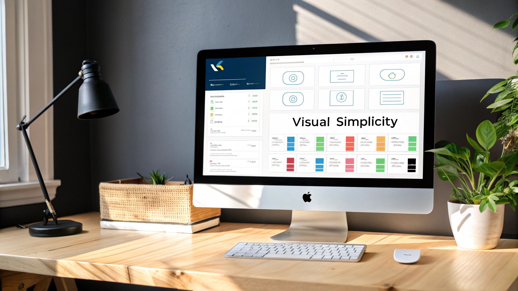
2. Implement Intuitive Visual Design
A well-designed sales dashboard is more than just a collection of charts and graphs; it's a powerful tool for understanding your business performance. Implementing intuitive visual design is crucial for transforming raw sales data into actionable insights. This best practice centres around creating visually appealing dashboards that present information clearly and efficiently, making them accessible to users of all technical levels, from TikTok Shop sellers to seasoned data analysts. By prioritizing both aesthetics and functionality, you can ensure your sales dashboard becomes an indispensable asset for data-driven decision-making.
This best practice earns its place on the list of sales dashboard best practices because it directly impacts how effectively users can interact with and understand the data presented. A poorly designed dashboard, no matter how rich the data, can lead to misinterpretations, wasted time, and ultimately, poor decisions. A visually intuitive design, on the other hand, empowers users to quickly grasp key performance indicators (KPIs), identify trends, and make informed decisions to optimise their sales strategies on platforms like TikTok Shop.
Intuitive visual design encompasses several key features: a logical information hierarchy, where the most important metrics are prominent; strategic use of colours, shapes, and contrast to highlight key information and differentiate data points; appropriate chart selection based on the data type (e.g., line charts for trends, bar charts for comparisons); effective use of white space to avoid visual clutter; and responsive design to ensure readability across various devices, from desktop computers to mobile phones.
Examples of Successful Implementation:
Several leading business intelligence platforms exemplify effective visual design. Tableau, for instance, emphasises colour psychology in their sales dashboard templates to evoke specific emotional responses and improve data retention. Microsoft Power BI leverages gestalt principles, like proximity and similarity, to create visually cohesive dashboards that are easy to navigate. Domo's minimalist approach, focusing on negative space and visual hierarchy, ensures users can quickly identify the most critical information.
Pros:
- Reduces time needed to interpret data: Users can quickly grasp key insights without needing to decipher complex visualizations.
- Increases dashboard adoption rates: A visually appealing dashboard is more engaging and encourages regular use.
- Improves data retention and comprehension: Clear visuals and logical layouts aid in understanding and remembering key data points.
- Enhances decision-making speed: Faster data interpretation translates to quicker, more informed decisions, which is crucial for fast-paced environments like eCommerce and TikTok Shop.
Cons:
- Can prioritize aesthetics over functionality if not balanced: Over-designing can obscure important information.
- Requires design expertise or specialized software: Creating highly effective visuals may necessitate design skills or access to specific software tools.
- May need customization for different user preferences: Different users may have varying visual preferences and accessibility needs.
Actionable Tips:
- Use a grid-based layout: Place the most critical metrics in the top-left quadrant, following the natural reading pattern of Western audiences (like in the UK).
- Limit your colour palette: Stick to 3-5 colours with consistent meaning throughout the dashboard to avoid visual overload.
- Choose appropriate visualizations: Line charts are ideal for displaying trends over time, bar charts for comparisons, and tables for presenting detailed figures.
- Test dashboard readability: Ensure your dashboard is legible at different screen sizes and resolutions to cater to users accessing it on various devices.
- Include clear titles, labels, and legends: Provide context and clarity to all visual elements.
By following these best practices, eCommerce entrepreneurs, TikTok Shop sellers, and digital marketing professionals in the UK can create compelling sales dashboards that provide valuable, at-a-glance insights, empowering them to make data-driven decisions that boost their bottom line. This approach is particularly crucial for early adoption beta testers and those operating in the rapidly evolving landscape of TikTok Shop, where staying ahead of the curve requires agile data analysis and rapid response times.
3. Enable Effective Data Filtering and Drill-Down Capabilities
A truly effective sales dashboard goes beyond simply presenting top-level figures. To unlock the full potential of your sales data and make informed decisions, implement robust filtering and drill-down capabilities. This is a crucial best practice for any sales dashboard, especially for TikTok Shop sellers, eCommerce entrepreneurs, and data-driven retailers operating in the competitive UK market. Enabling these features transforms a static report into an interactive tool for exploring trends, diagnosing issues, and ultimately, boosting sales.
This functionality allows users to dissect data from various perspectives, investigate anomalies, and tailor their view based on individual needs and responsibilities. Imagine you're a TikTok Shop seller seeing a dip in sales. A well-designed dashboard lets you quickly filter by product, date range, or even specific promotional campaigns to pinpoint the source of the decline. This targeted approach is far more effective than staring at overall sales figures and guessing at the cause.
Here's a breakdown of key features that contribute to powerful data exploration:
- Interactive Filtering Options: Filter data by various dimensions, such as time period, product category, region, marketing channel (especially crucial for TikTok Shop sellers), and customer demographics. This granular control empowers users to isolate specific data subsets for analysis.
- Hierarchical Data Navigation: Move seamlessly from high-level summaries to detailed granular data. For instance, start with overall monthly sales and drill down to see daily performance for individual products within a specific TikTok campaign.
- Cross-Filtering Between Dashboard Elements: Selecting a data point in one part of the dashboard automatically filters other related elements. For example, clicking on a specific product in a sales chart could update a related table showing top-performing TikTok ads for that product.
- Customizable Filter Presets: Save frequently used filter combinations for common analyses. This saves time and ensures consistency across reports. Imagine a preset for analysing weekly TikTok campaign performance or monthly sales by region.
- Historical Data Comparison: Compare current performance against previous periods to identify trends and track progress towards goals. This is crucial for evaluating the long-term impact of TikTok marketing strategies.
The benefits of these features are numerous:
- Provides Contextual Depth: High-level metrics gain significance when users can delve deeper to understand the underlying factors.
- Supports Root Cause Analysis: Identifying the root cause of sales fluctuations is essential for implementing effective solutions. Drill-down capabilities facilitate this process.
- Accommodates Different Information Needs: A single dashboard can cater to the diverse needs of different stakeholders, from marketing professionals to early adoption beta testers.
- Reduces the Need for Multiple Separate Reports: Consolidated, interactive dashboards replace the need for numerous static reports, streamlining reporting processes.
However, implementing these features also presents some challenges:
- Increased Technical Complexity: Building interactive dashboards requires more sophisticated development effort.
- May Require Additional Server Resources: Processing complex queries and handling interactive filtering can strain server resources.
- Potential for User Overwhelm: A poorly designed interface with excessive filtering options can confuse users.
Successful implementations can be seen in platforms like Salesforce Einstein Analytics, which provides guided drill-downs, Looker, which utilizes derived tables for multi-level data exploration, and InsightSquared, which offers seamless transitions between summary and detail views. Learn more about Enable Effective Data Filtering and Drill-Down Capabilities.
Here are some actionable tips for implementing effective filtering and drill-down functionality in your sales dashboards:
- Design a Logical Drill-Down Path: Structure the drill-down paths to align with typical sales decision-making processes.
- Include Breadcrumb Navigation: Help users track their exploration path and easily return to previous levels of detail.
- Provide Filter Reset Options: Allow users to quickly revert to the default view.
- Create Predefined Filter Combinations: Offer pre-configured filters for common analysis scenarios.
- Train Users on Effective Filtering Techniques: Ensure users understand how to leverage the filtering and drill-down capabilities to maximize their insights.
By incorporating these best practices, you can empower your team with a truly interactive and insightful sales dashboard, driving data-driven decision making and ultimately improving your bottom line, whether you're a TikTok Shop seller, an eCommerce entrepreneur, or a digital marketing professional in the UK.
4. Ensure Real-Time or Near Real-Time Data Updates
In the dynamic world of TikTok Shops, eCommerce, and digital marketing, having up-to-the-minute insights is no longer a luxury – it's a necessity. This is why ensuring real-time or near real-time data updates for your sales dashboards is a crucial best practice for anyone serious about optimising their performance. Stale data leads to stale decisions. This best practice empowers you to make proactive, data-driven decisions that can significantly impact your bottom line. For TikTok Shop sellers, eCommerce entrepreneurs, and data-driven retailers, this means staying ahead of trends, reacting swiftly to changes in customer behaviour, and ultimately, maximising profit.
Real-time or near real-time updates mean that your sales dashboard reflects the current state of your business, not how it was hours or even days ago. This is achieved through automated data refresh mechanisms that constantly pull data from various sources and update the dashboard. This could mean seeing live sales figures, immediate feedback on marketing campaigns, or up-to-the-minute inventory levels. Imagine knowing within seconds which TikTok video is driving the most conversions, allowing you to double down on that strategy instantly. This is the power of real-time data.
How it Works:
Implementing real-time updates involves optimising your data pipeline for speed, from data collection and processing to its visualisation on your dashboard. This often includes features like:
- Automated data refresh mechanisms: These systems automatically pull data from various sources at predefined intervals.
- Data pipeline optimisation for speed: This involves streamlining the flow of data to minimise delays.
- Timestamp indicators showing last update time: These provide transparency and ensure users are aware of the data's freshness.
- Alert systems for significant metric changes: These systems notify you of unusual activity, allowing for immediate action.
- Caching strategies for performance balance: Caching can improve dashboard loading times while still providing relatively recent data.
Examples of Successful Implementation:
Giants like Amazon and Shopify have demonstrated the power of real-time data. Amazon's sales dashboards update every 10 seconds during peak periods, providing unparalleled insights into customer behaviour. Shopify uses streaming analytics to give merchants a live view of their store performance. Similarly, platforms like Gong.io provide near-instant call analysis for sales teams, offering valuable insights for improving sales techniques.
Pros:
- Enables proactive decision-making: React to opportunities and address challenges as they happen, rather than hours or days later.
- Increases dashboard relevance and usage: A constantly updated dashboard becomes an invaluable tool, encouraging frequent use.
- Improves sales agility and responsiveness: Adapt quickly to market changes and customer demands.
- Creates a single source of truth for current performance: Eliminates confusion and ensures everyone is working with the same accurate data.
Cons:
- Can require significant technical infrastructure: Setting up and maintaining real-time systems can be complex and costly.
- May increase system costs and complexity: Real-time data processing requires more resources.
- Real-time data may contain temporary anomalies causing false alarms: Short-term fluctuations can trigger alerts that aren't indicative of a real problem.
Tips for Implementation:
- Balance update frequency with system performance: Find the sweet spot between real-time insights and system stability.
- Clearly display the timestamp of the last data refresh: Maintain transparency about data freshness.
- Implement data validation checks to flag potential anomalies: Reduce the risk of false alarms.
- Consider different update frequencies for different metrics: Some metrics, like website traffic, might benefit from real-time updates, while others, like monthly revenue, may only require daily updates.
- Use visual indicators to highlight metrics that have recently changed significantly: Draw attention to key areas requiring action.
Why This is a Crucial Sales Dashboard Best Practice:
In today's competitive landscape, especially within the fast-paced world of TikTok Shops and eCommerce, the ability to react quickly is paramount. Real-time data empowers you to capitalise on fleeting opportunities, mitigate potential issues before they escalate, and make informed decisions based on the most current information. For early adoption beta testers and digital marketing professionals, access to real-time data is particularly valuable for identifying what resonates with your audience and refining your strategies accordingly. By embracing real-time data, you're not just building a dashboard; you're building a competitive advantage.
5. Create Role-Specific Dashboard Views
One of the most impactful sales dashboard best practices is creating role-specific views. This means tailoring the information displayed on the dashboard to match the specific needs and responsibilities of different stakeholders within your organisation. A one-size-fits-all dashboard often leads to information overload and can hinder decision-making. By segmenting your dashboards, you empower each user with the precise data they need to excel in their role, whether they're a sales representative on the ground, a sales manager overseeing a team, or an executive charting the overall sales strategy.

For example, a sales representative might need to see their individual sales performance against targets, key performance indicators (KPIs) like conversion rates, and real-time updates on leads. A sales manager, on the other hand, would benefit from a dashboard showing team performance, regional sales figures, and pipeline analysis. Executives, meanwhile, require a high-level overview of overall sales revenue, market share, and key strategic metrics. This approach ensures that every individual has access to the most relevant information, presented in a way that's easy to understand and act upon. This best practice is especially relevant for TikTok Shop sellers, eCommerce entrepreneurs, and data-driven retailers who need granular insights into various aspects of their online businesses, including sales trends, ad performance, and customer behavior. By customizing dashboard views, these stakeholders can track the most relevant metrics, enabling them to make informed decisions that drive profitability and growth.
Features of Role-Specific Dashboards:
- User-specific metric selection and prioritisation: Choose the KPIs that matter most to each role.
- Appropriate level of detail: Provide the right granularity of information for each user's needs.
- Customizable layouts and visualizations: Allow users to personalize their view for optimal understanding.
- Role-based access controls: Ensure data security and confidentiality.
- Personalized alert thresholds: Notify users about critical changes based on their specific responsibilities.
Pros:
- Increased dashboard relevance and user adoption
- Focused attention on role-appropriate metrics
- More effective decision-making at all levels
- Reduced information overload and confusion
Cons:
- Requires additional development and maintenance resources
- Can create data silos if not properly implemented
- Needs regular review to ensure alignment with changing roles
Examples:
- Microsoft Dynamics 365's role-centred workspace approach provides tailored experiences for different users.
- Salesforce's Lightning Dashboard Folders allow for role-specific sharing and access control.
- Zoho CRM's persona-based analytics dashboards cater to different user profiles.
Actionable Tips:
- Interview stakeholders: Understand their key decisions and information needs. What are their daily challenges and what information would help them overcome these?
- Create a metrics-to-roles matrix: Map out which metrics are relevant to each role before building dashboards. This will help avoid redundancy and ensure clarity.
- Design executive views for strategic metrics: Focus on high-level trends and overall performance.
- Design manager views for operational metrics: Highlight team performance, pipeline health, and actionable insights.
- Include core metrics across all roles: Ensure alignment on key objectives and overall performance.
- Provide user customization options: Allow for personalization within role-based templates.
- Regularly review usage patterns: Refine role-specific views based on user feedback and evolving business needs.
This best practice deserves its place in the list because it directly addresses the challenge of information overload and empowers users to make data-driven decisions. By tailoring dashboards to specific roles, businesses in the UK, especially those operating on platforms like TikTok Shop, can unlock the full potential of their sales data and drive significant improvements in performance. By following these tips, you can create effective, role-specific dashboards that will help your UK-based business thrive in the competitive online marketplace. This approach, popularized by platforms like Salesforce, Microsoft Dynamics 365, and Zoho CRM, as well as sales thought leaders like Jacco van der Kooij, is becoming increasingly critical for modern sales organisations, particularly for those operating in fast-paced digital environments.
6. Incorporate Predictive Analytics and Forecasting
One of the most impactful sales dashboard best practices for modern businesses, particularly for data-driven retailers and TikTok Shop sellers in the UK, is incorporating predictive analytics and forecasting. A truly effective sales dashboard doesn't just show what has happened; it anticipates what's likely to happen. By integrating predictive capabilities, your dashboard transforms from a historical record-keeper into a powerful tool for proactive sales management. This forward-looking approach allows eCommerce entrepreneurs and digital marketing professionals to anticipate market trends, identify potential opportunities and risks, and optimise strategies based on data-driven projections. This is especially valuable in the fast-paced world of TikTok Shop, where trends can shift rapidly.
How it Works:
Predictive analytics uses historical data, statistical algorithms, and increasingly, AI and machine learning, to project future sales performance. Features like deal probability scoring, pipeline health predictions, and what-if scenario modelling provide valuable insights that empower you to make more informed decisions. For example, trend analysis and extrapolation can reveal emerging product demand on TikTok, while AI-powered sales forecasting models can anticipate seasonal sales peaks and help you optimize inventory levels accordingly.
Examples of Successful Implementation:
Several platforms offer powerful predictive analytics features relevant to TikTok Shop sellers and other online retailers:
- Salesforce Einstein: Provides opportunity scoring and pipeline predictions to identify high-potential deals and forecast future revenue.
- InsightSquared: Offers forecast accuracy and pipeline coverage models to help you fine-tune your sales strategy and ensure consistent pipeline growth.
- Clari: Uses time-series forecasting with confidence intervals to project sales performance with a degree of certainty, allowing for better resource allocation.
Actionable Tips for Implementation:
- Start Simple: Begin with basic forecasting models and gradually increase complexity as your data and understanding grow.
- Visual Clarity: Clearly differentiate between actual data and predictions in your dashboard visualizations.
- Confidence Intervals: Include confidence intervals or ranges with your point forecasts to understand the potential variability.
- Regular Model Validation: Continuously compare forecasts with actual results to refine your models and improve accuracy.
- Multiple Methods: Employ a combination of forecasting methods (statistical, judgment-based, AI) for a more robust and comprehensive view.
- Contextualize Predictions: Provide historical data alongside predictions to offer context and insights into the underlying trends.
Pros:
- Proactive Management: Shifts the focus from reacting to past performance to proactively managing future outcomes.
- Improved Forecast Accuracy: Leads to more reliable sales forecasts and better business planning.
- Early Risk Identification: Helps identify at-risk deals and potential pipeline bottlenecks before they impact revenue.
- Strategic Resource Allocation: Enables more efficient allocation of resources based on predicted demand and opportunities.
- Enhanced Pipeline Management: Provides a clearer picture of pipeline health and helps optimize sales processes.
Cons:
- Data Dependency: Requires sufficient historical data for accurate predictions, which might be a challenge for newer TikTok Shops.
- Technical Complexity: Implementing advanced predictive analytics can be technically challenging and may require specialized expertise.
- Over-Reliance: Over-dependence on predictions without considering human judgment and market dynamics can be detrimental.
- Model Maintenance: Predictive models require regular training and validation to maintain accuracy and relevance.
Why This Deserves a Place on the List:
In the competitive landscape of eCommerce and particularly within the dynamic environment of TikTok Shop, incorporating predictive analytics into your sales dashboard is no longer a luxury but a necessity. It empowers you to anticipate market fluctuations, make data-driven decisions, and ultimately, outperform your competition. By understanding future trends and potential risks, early adoption beta testers and established businesses alike can optimize their TikTok Shop strategies for maximum profitability. For UK-based sellers, understanding local trends and anticipating demand are crucial for success, and predictive analytics provides the necessary insights to achieve these goals.
7. Implement Comparative Benchmarking
One of the most effective sales dashboard best practices is implementing comparative benchmarking. Raw sales figures, while important, don't tell the whole story. Is £10,000 in revenue good or bad? To answer that, you need context. Comparative benchmarking provides this context by comparing your key performance indicators (KPIs) against various benchmarks, such as past performance, team averages, competitor data, or industry standards. This allows you to understand where your performance truly stands and identify areas for improvement within your TikTok Shop or other eCommerce ventures.
This best practice deserves a place on this list because it transforms data into actionable insights. By comparing your current performance with previous periods (year-over-year, quarter-over-quarter), you can track trends and identify seasonal patterns. Internal team and individual benchmarking fosters healthy competition and motivates sales teams, especially beneficial for TikTok Shop sellers and eCommerce entrepreneurs striving for rapid growth. Target-to-actual variance analysis highlights where you are exceeding or falling short of your goals, allowing for timely adjustments to your sales strategies. Incorporating industry standard comparisons (if available for your specific niche) offers a valuable external perspective. For example, knowing the average conversion rate for TikTok Shop retailers in the UK selling similar products allows you to gauge your effectiveness. Features like percentile rankings and performance distribution curves offer a more nuanced view of your standing within a larger context. You can learn more about Implement Comparative Benchmarking for additional insights.
Actionable Tips for Implementation:
- Use Consistent Metrics: Ensure you're comparing apples to apples. Use consistent time periods and calculation methods for fair comparisons across benchmarks.
- Diversify Benchmarks: Include a mix of historical, peer (internal team or competitor), and target benchmarks for a balanced perspective.
- Normalise Data: Consider normalising metrics by relevant factors, like territory size, market potential, or salesperson tenure, to account for disparities. For instance, a new TikTok Shop might not be directly comparable to an established one.
- Visualise Benchmark Comparisons: Employ clear visual indicators (colours, icons, up/down arrows) on your sales dashboard to instantly show whether KPIs are above or below benchmark.
- Regularly Update Benchmarks: Market conditions and internal team performance change. Update benchmarks regularly (e.g., quarterly) to ensure they remain relevant.
- Interactive Controls: Give users control over the dashboard. Allow them to select specific comparison groups or time periods for more granular analysis.
Pros of Comparative Benchmarking:
- Provides context and meaning to otherwise raw performance data.
- Motivates performance through healthy competition (especially useful for TikTok Shop sellers).
- Pinpoints performance gaps and opportunities for improvement.
- Supports more objective performance evaluations.
- Enables more informed and meaningful goal setting.
Cons of Comparative Benchmarking:
- Can create undue pressure if overemphasised.
- Requires careful selection of appropriate and fair comparison points.
- Can be misleading if benchmarks aren't normalised for influencing factors.
- Obtaining reliable industry benchmarks may necessitate access to third-party data sources.
Examples of Successful Implementations:
While specific examples related to TikTok Shop benchmarking are scarce due to its relative novelty, the principles remain the same. Imagine comparing your TikTok Shop's engagement rate with your competitors or benchmarking your cost-per-acquisition against the average for your product category. More established platforms like HubSpot, LinkedIn Sales Navigator, and ZoomInfo offer features like peer performance distribution curves and industry vertical comparisons, providing inspiration for how benchmarking can be integrated into sales dashboards. Companies like SalesLoft and Miller Heiman Group promote sales best practices that emphasize the value of comparative benchmarking.
By implementing these sales dashboard best practices, particularly comparative benchmarking, TikTok Shop sellers, eCommerce entrepreneurs, and other data-driven retailers in the UK can gain a much deeper understanding of their sales performance, unlock growth potential, and achieve their business objectives.
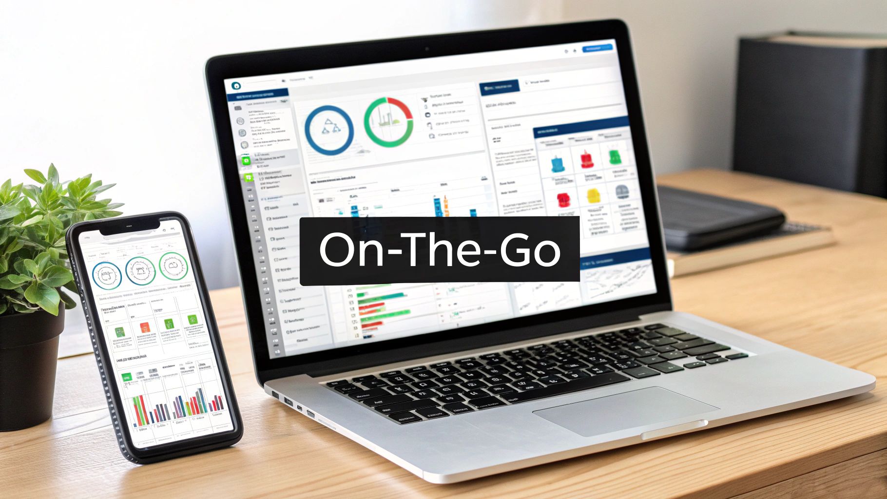
8. Ensure Mobile Accessibility and Cross-Platform Functionality
In today's fast-paced business environment, staying connected is crucial, especially for sales teams constantly on the move. This is why mobile accessibility and cross-platform functionality are essential sales dashboard best practices. Your sales team likely uses a variety of devices – smartphones, tablets, laptops, and desktops – throughout their workday. Ensuring your sales dashboards are accessible and fully functional across all these platforms empowers your team to access critical sales data anytime, anywhere, ultimately leading to better performance and more informed decision-making. This is a crucial component of any effective sales operation, especially for TikTok Shop sellers, eCommerce entrepreneurs, and data-driven retailers looking to maximise their profits.
This best practice involves designing and developing dashboards that adapt seamlessly to different screen sizes and operating systems. It means that regardless of whether a sales professional is checking their phone between client meetings in London, reviewing performance on their tablet during their commute, or presenting to a team on their laptop in the office, the dashboard delivers a consistent and user-friendly experience.
Features of Mobile-First Sales Dashboards:
- Responsive Design: The dashboard layout automatically adjusts to fit different screen sizes, ensuring readability and usability.
- Touch-Optimized Interface: Navigation and interaction are designed for touchscreens, with elements like larger buttons and swipe gestures.
- Offline Viewing Capabilities: For field sales operating in areas with limited connectivity, offline access to key data is vital.
- Synchronized Data: Real-time data synchronization across all platforms ensures everyone is working with the most up-to-date information.
- Simplified Mobile Views: Complex dashboards are often simplified for mobile viewing, prioritizing the most essential metrics.
- Push Notifications: Real-time alerts for crucial updates, like reaching a sales target or a significant change in a key metric, can be delivered directly to mobile devices.
Pros:
- Increased Dashboard Usage and Adoption Rates: Easy access encourages regular use.
- Supports Real-Time Decision-Making in the Field: Access to data on the go allows for immediate responses to market changes or client needs.
- Improves Sales Meeting Effectiveness: Up-to-the-minute data enhances presentations and client interactions.
- Enables Continuous Performance Monitoring Regardless of Location: Sales managers and team members can track progress and identify areas for improvement from anywhere.
- Enhances Productivity for Remote and Traveling Sales Teams: Empowers remote and field-based teams with the information they need to be successful.
Cons:
- Additional Development and Testing: Building cross-platform functionality requires more development and rigorous testing across devices and operating systems.
- Compromises in Visualization Complexity: Simplified mobile views might necessitate reducing the complexity of certain visualizations.
- Security Challenges with Mobile Access: Protecting sensitive data on mobile devices requires robust security measures.
- Potentially Higher Development and Maintenance Costs: The additional development and ongoing maintenance can increase costs.
Examples of Successful Implementations:
- Salesforce Mobile App: Offers optimized dashboards specifically for field sales, providing quick access to key customer and sales data.
- Tableau Mobile: Implements intuitive gesture-based interaction for seamless navigation and data exploration on touch devices.
- Microsoft Power BI Mobile: Provides a responsive phone layout feature, ensuring a user-friendly experience on smaller screens.
Actionable Tips for Implementing Mobile-First Dashboards:
- Prioritize Critical Metrics: Focus on the most important metrics for smaller screen formats.
- Design Touch-Friendly Interface Elements: Use larger buttons, swipe navigation, and other touch-optimized elements.
- Test Across Multiple Devices and OS: Thoroughly test dashboard functionality on various devices and operating systems to ensure compatibility and a consistent user experience.
- Implement Data Compression and Caching: Optimize mobile loading times by compressing data and leveraging caching techniques.
- Create Simplified Mobile Versions: Develop specific dashboard versions optimized for mobile contexts.
- Use Progressive Disclosure: Manage complex information on small screens by progressively revealing details as needed.
- Consider Offline Functionality: Implement offline access for areas with limited or unreliable internet connectivity.
By prioritizing mobile accessibility and cross-platform functionality, you empower your sales team with the information they need, when and where they need it. This best practice is fundamental for modern sales teams, particularly for those operating within the dynamic landscape of TikTok Shop, eCommerce, and digital marketing, where agility and real-time data are crucial for success. This investment in accessible data translates directly to increased productivity, improved decision-making, and ultimately, higher sales performance. Solutions like Salesforce Mobile, Tableau Mobile, Microsoft Power BI Mobile, Domo Mobile, and Google Data Studio have popularized this mobile-first approach, demonstrating its effectiveness in driving sales success.
8-Point Sales Dashboard Best Practices Comparison
| Strategy | 🔄 Complexity | ⚡ Resources | 📊 Outcomes | 💡 Ideal Use Cases | ⭐ Advantages |
|---|---|---|---|---|---|
| Define Clear KPIs and Metrics | Moderate; requires aligning metrics with business goals | Low to moderate; minimal development with periodic reviews | Focused insights for strategic decision-making | Organizations needing streamlined, focused dashboards | Clear focus, reduced noise, and measurable accountability |
| Implement Intuitive Visual Design | Moderate-High; demands design expertise and iteration | Moderate to high; investment in design tools and software | Faster data interpretation and adoption | Teams with diverse technical levels and high UX requirements | Improved readability and quick decision-making |
| Enable Effective Data Filtering and Drill-Down | High; interactive filtering adds multi-level complexity | High; advanced technical integration and processing needs | In-depth analysis through contextual drill-downs | Environments requiring multi-dimensional data exploration | Enhanced root cause analysis and personalized views |
| Ensure Real-Time or Near Real-Time Data Updates | High; real-time systems add processing and validation load | High; robust ETL, high-performance databases, and APIs | Immediate, up-to-date insights enabling agility | Time-sensitive operations needing instant data refresh | Proactive decisions and sustained data relevance |
| Create Role-Specific Dashboard Views | Moderate; customization for varied roles adds complexity | Moderate; ongoing development and maintenance | Tailored views improving decision efficiency | Organizations with diverse stakeholder information needs | Targeted content reducing overload and boosting adoption |
| Incorporate Predictive Analytics and Forecasting | High; advanced AI models and statistical analyses required | High; demands clean data, ML integration, and processing power | Proactive forecasts with improved pipeline management | Enterprises investing in data-driven, forward-looking strategy | Enhanced foresight and strategic resource allocation |
| Implement Comparative Benchmarking | Moderate; integrating multiple comparison standards needed | Moderate; may involve external data sources and adjustments | Contextualized performance insights for better eval. | Companies focused on performance evaluation & benchmarking | Objective gap analysis with motivating benchmarks |
| Ensure Mobile Accessibility and Cross-Platform Functionality | Moderate-High; requires designing responsive, secure interfaces | High; extra development, multi-device testing, and security measures | Continuous access enabling field-based decisions | Mobile-centric sales teams and remote workforce | Increased adoption and productivity via cross-platform support |
Elevate Your Sales Performance with Mergoio
Mastering sales dashboard best practices is crucial for any data-driven business, especially in the fast-paced world of TikTok Shop and eCommerce. From defining clear KPIs like conversion rates and average order value, to implementing intuitive visual design and real-time data updates, each element plays a vital role in transforming raw data into actionable insights. Remember the importance of role-specific views, ensuring your marketing team sees different data than your logistics team, and leveraging predictive analytics to anticipate future trends and stay ahead of the curve. By implementing these sales dashboard best practices, you empower your team to identify opportunities, optimise campaigns, and ultimately, drive revenue growth. Effective comparative benchmarking helps you understand your performance against competitors, while mobile accessibility ensures you can monitor your key metrics on the go.
These best practices aren't just theoretical concepts; they are the building blocks of a successful data-driven strategy. By embracing these principles, you’re not just viewing data, you're harnessing its power to make informed decisions that significantly impact your bottom line. For UK-based TikTok Shop sellers, eCommerce entrepreneurs, and digital marketing professionals, this translates to a competitive edge in a dynamic market.
Ready to implement these sales dashboard best practices and unlock the full potential of your TikTok Shop data? Mergoio offers a comprehensive platform designed specifically for TikTok Shop (and soon Amazon) sellers, providing real-time analytics, a fully customisable dashboard, and predictive insights – all in one place. Visit Mergoio today to explore how Mergoio can help you visualise your key metrics, streamline your workflow, and elevate your sales performance.
Leave a Reply